A New Note: Transforming Earbuds' Brand Identity
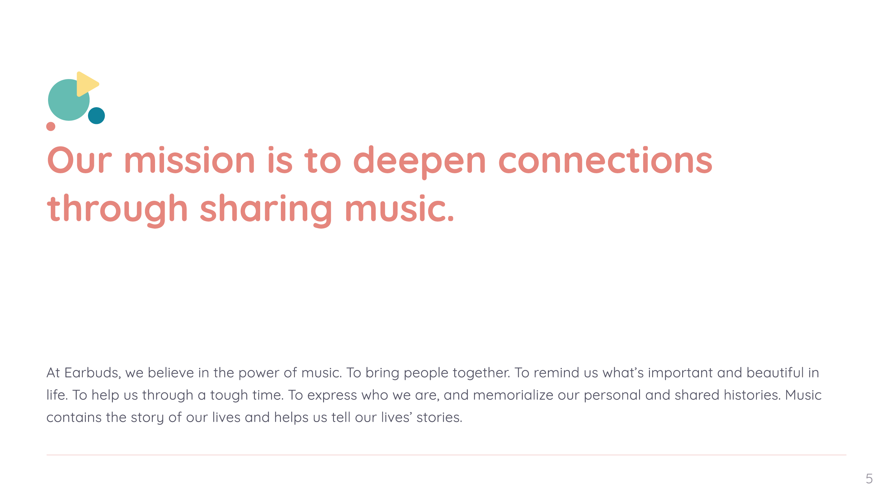
Our mission is to deepen connections through sharing music.
Overview
As our company underwent a rebranding and a significant shift in the apps direction, we needed to reevaluate our brand identity and redesign the Earbuds logo to align with our new vision, as it will become the blueprint of our brand’s heart and soul, guiding every step we take and every decision we make.
At Earbuds, we believe in the power of music. To bring people together. To remind us what’s important and beautiful in life. To help us through a tough time. To express who we are, and memorialize our personal and shared histories.
Goals & Objectives
- Revamp: Refreshing the brand’s image to fit new pivot and vision.
- Differentiation: Create a unique and memorable visual identity to set us apart from competitors.
- Clarity and Consistency: Establish clear guidelines for consistent brand presentation across all touchpoints.
- Enhanced Perception: Improve the brand’s perception among our target audience and stakeholders.
- Adaptability and Scalability: Develop a visual identity adaptable to various mediums and contexts.
Target Audience
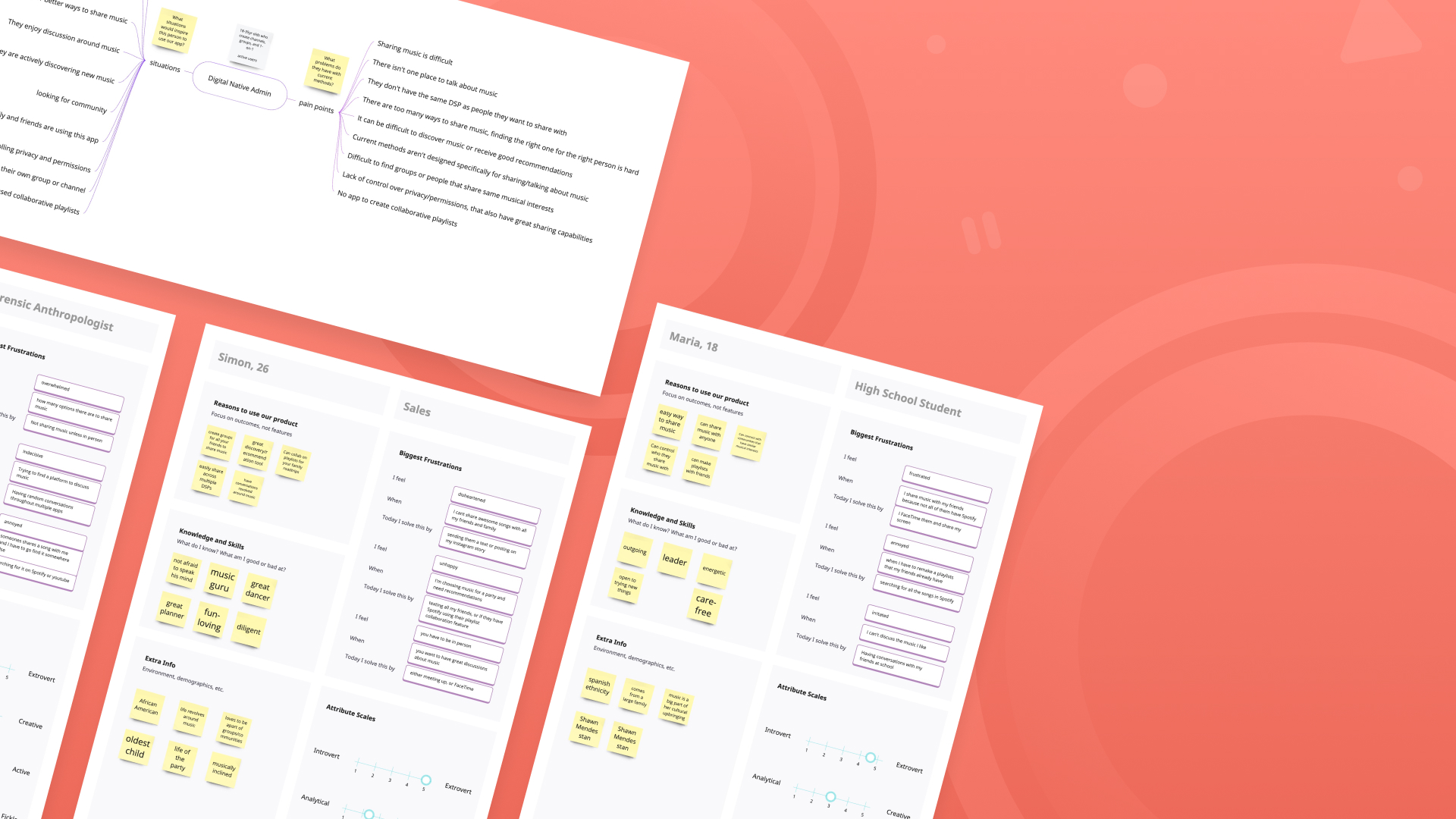
Our “Super Specific Who” consists of Gen Z and digital natives 18-35 years of age, who have a profound love for music and who often share, listen, and engage in discussions about music.
Pain Points
- Difficulty in sharing music
- Lack of centralized platforms for music discussions
- Limited compatibility with desired Digital Service Providers (DSPs)
- Challenges in discovering music or receiving quality recommendations
- Current methods not tailored for music sharing or discussion
- Difficulty in finding like-minded individuals or groups
- Lack of control over privacy settings for shared music
- Absence of an app for creating collaborative playlists
Logo Rebrand
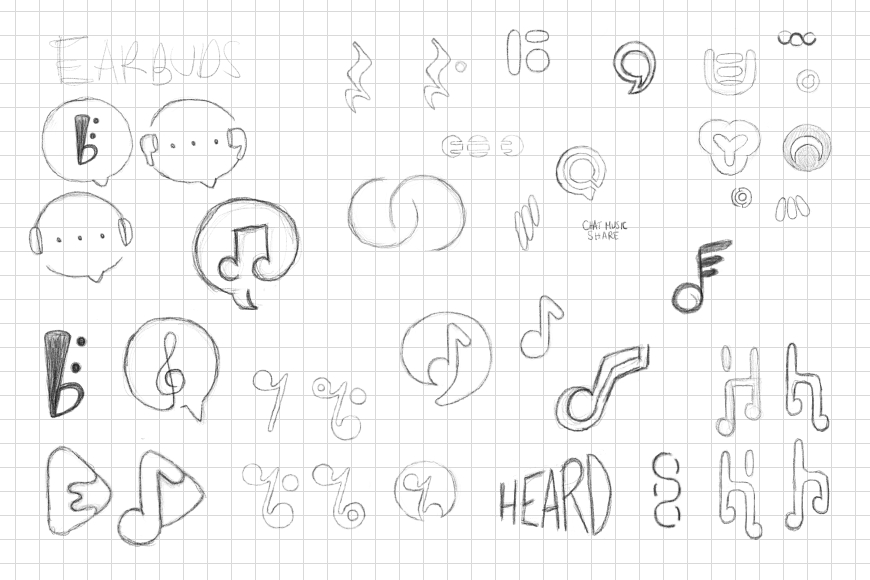
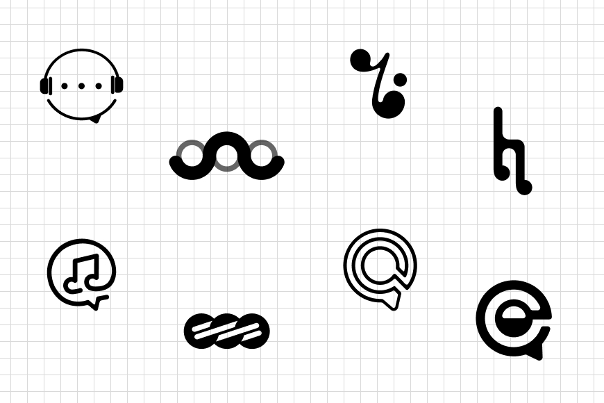
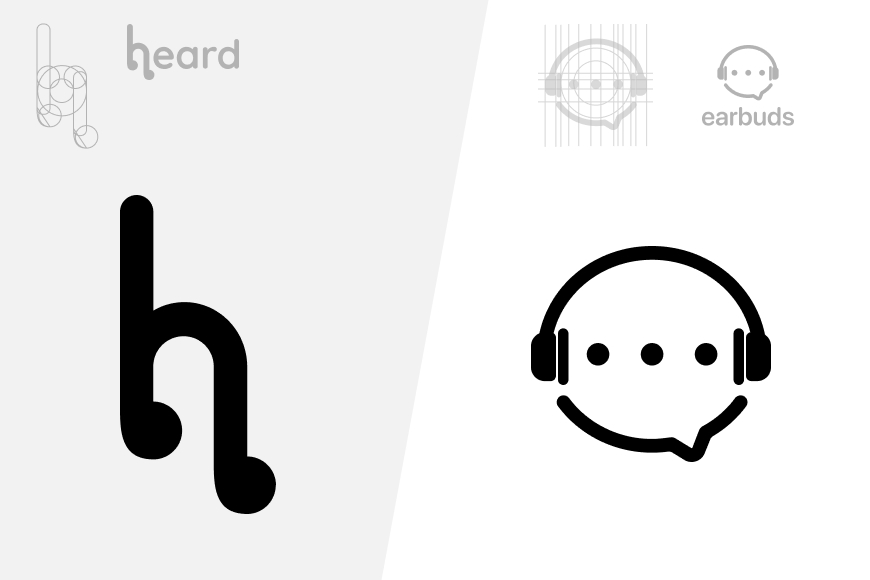
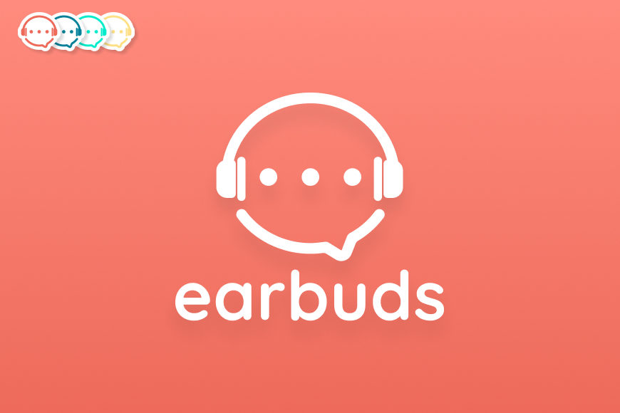
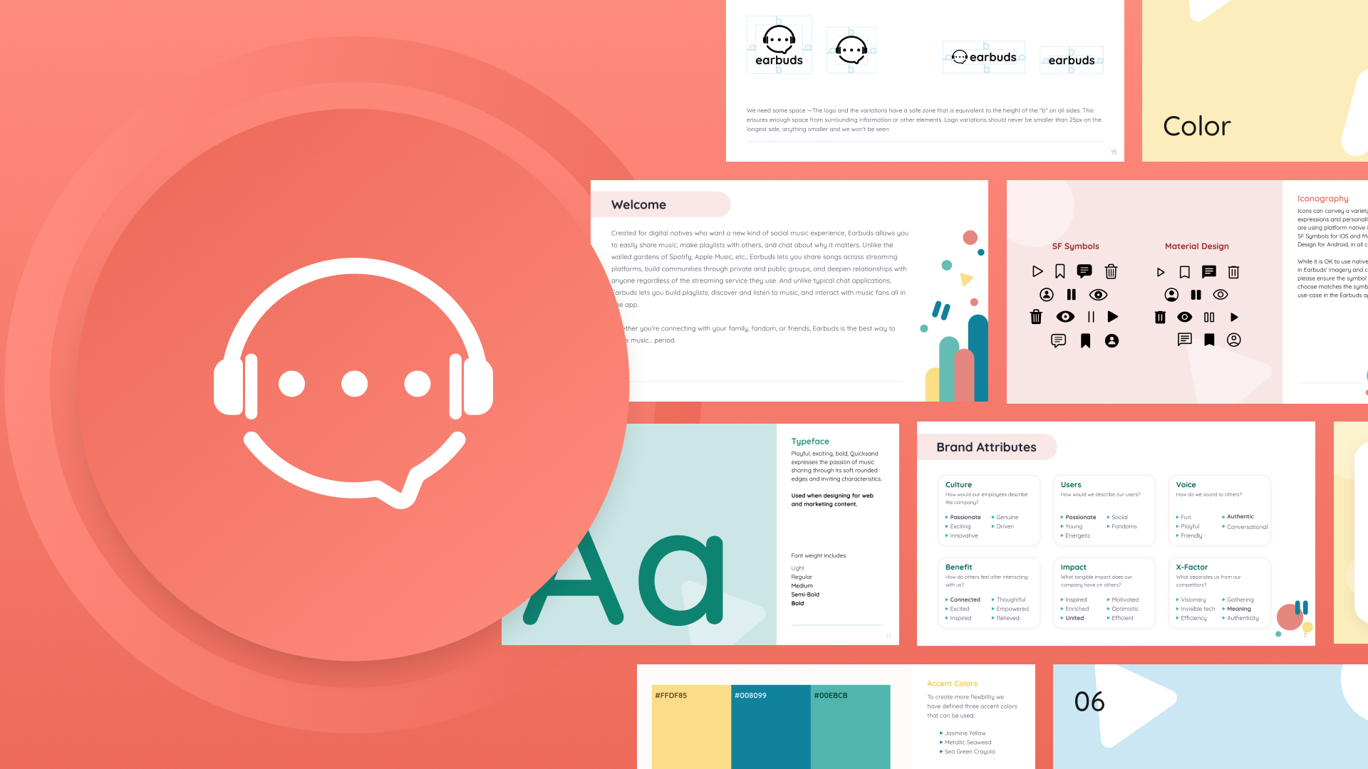
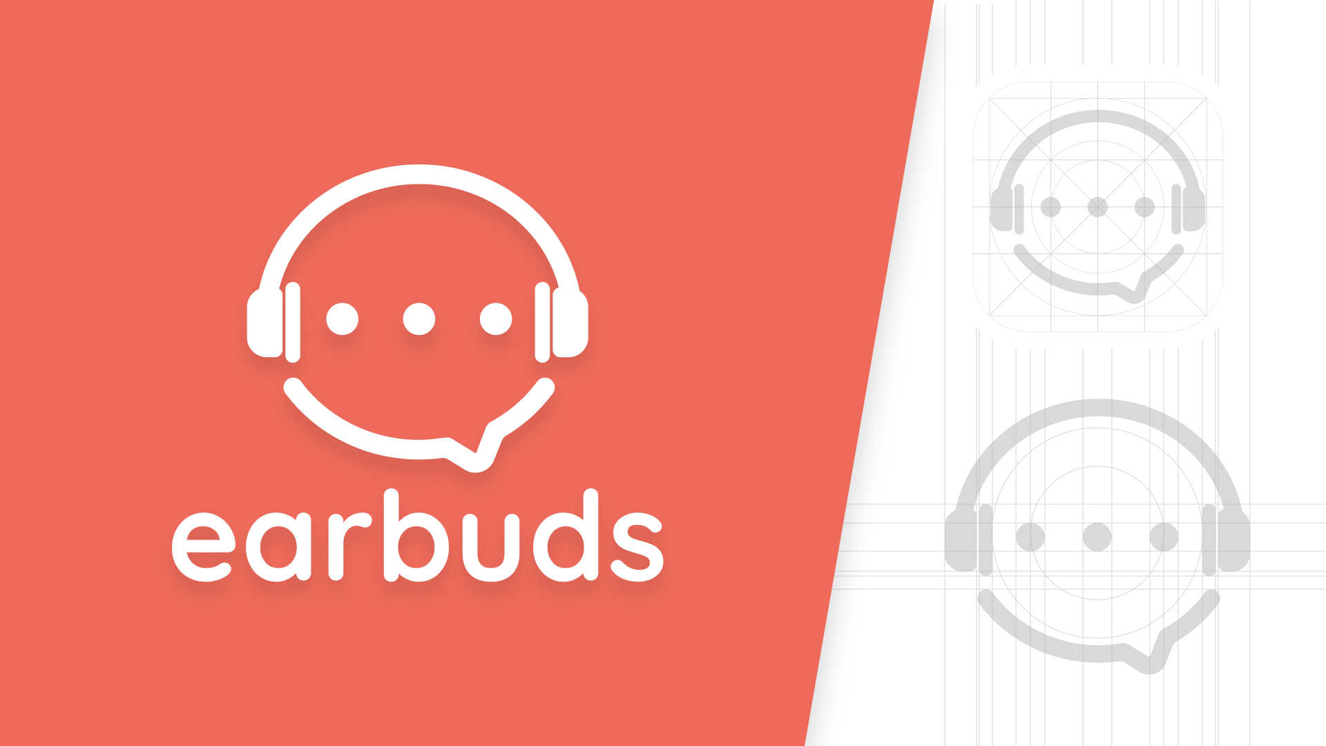
Our logo is the visual foundation of our identity and is critical to the brand’s expression. As we rebranded, we wanted the Earbuds logo to convey playfulness, connectivity, and a love for not only listening to music but also chatting about music, through its color, soft edges, and distinctive icon.
Brand Guidelines
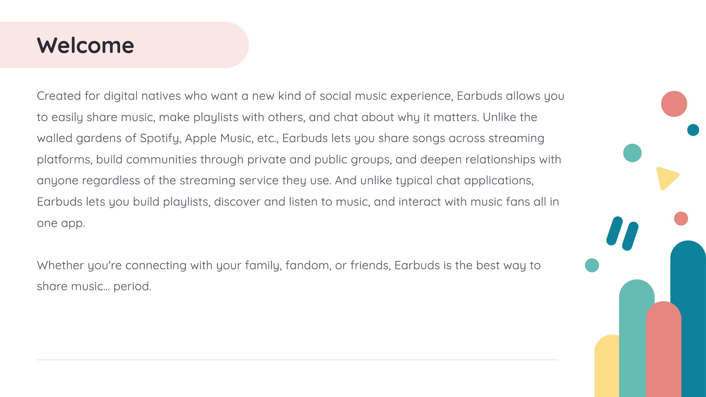
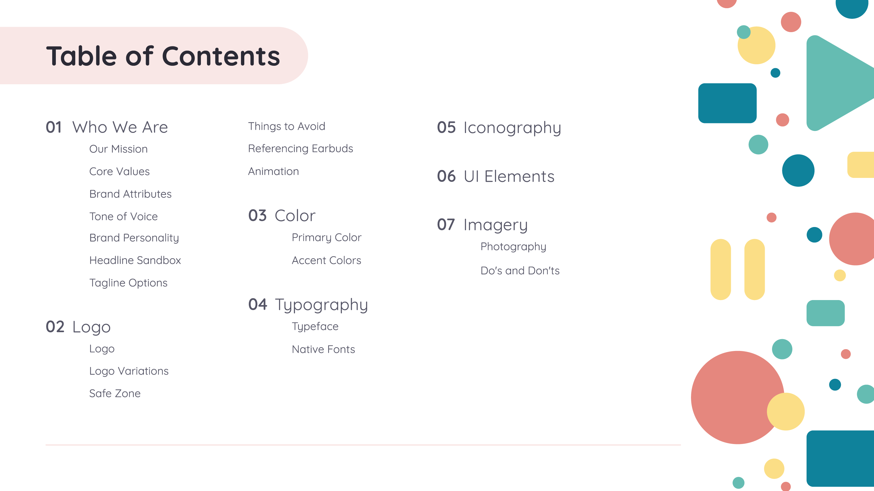
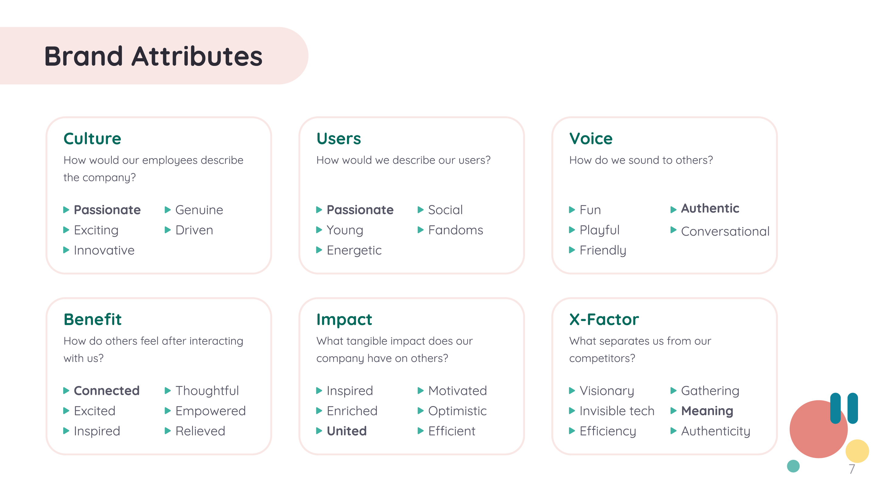
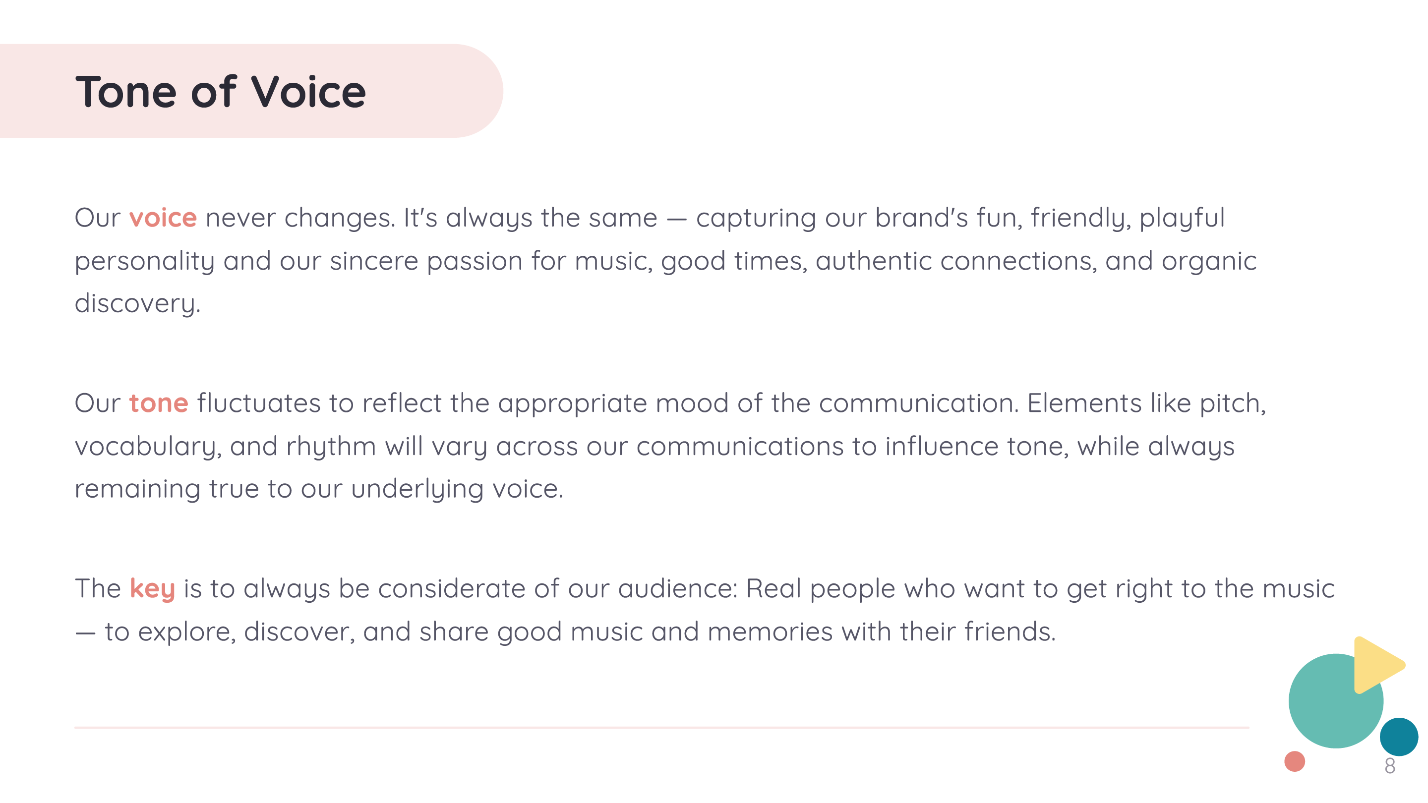
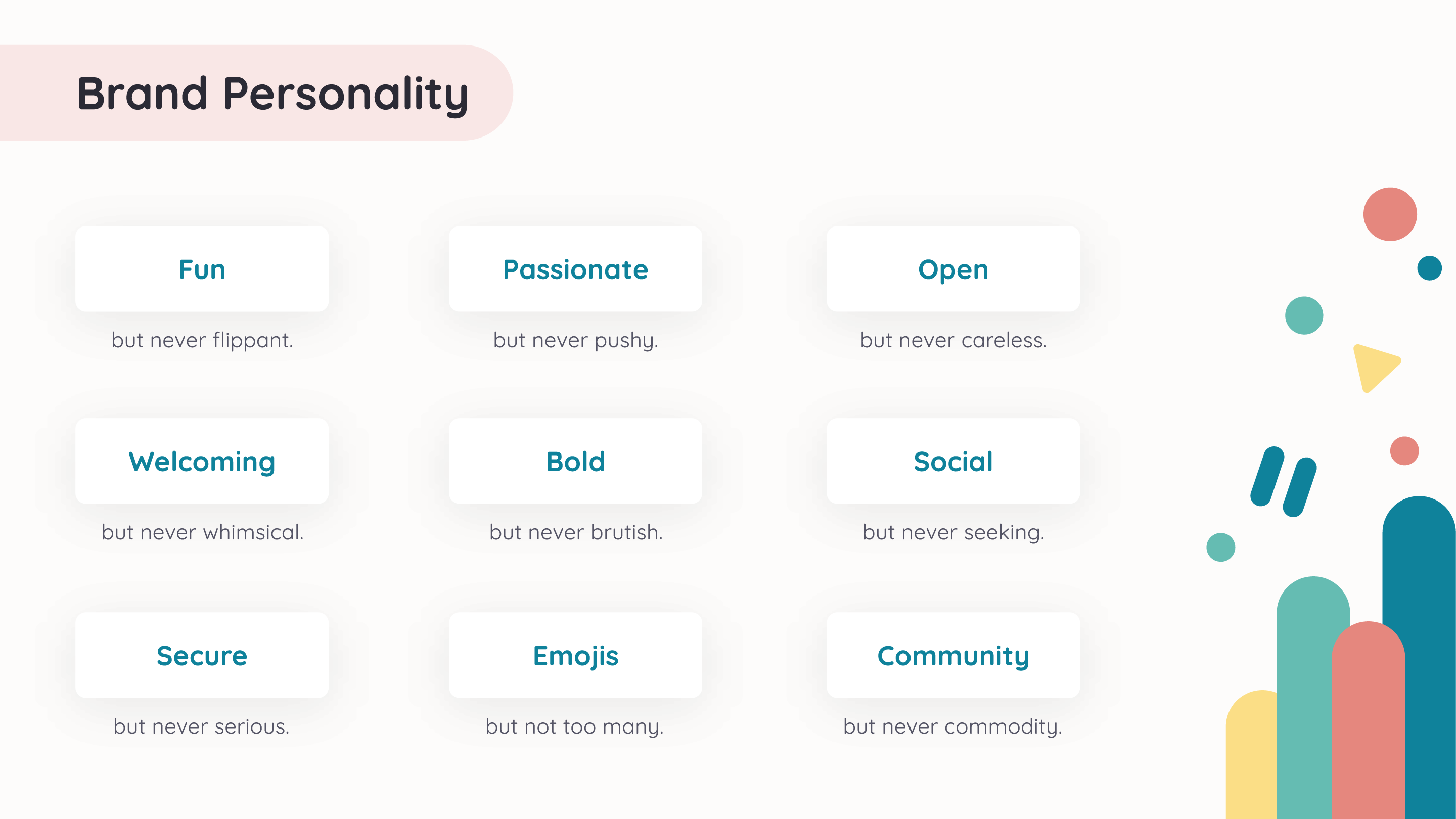
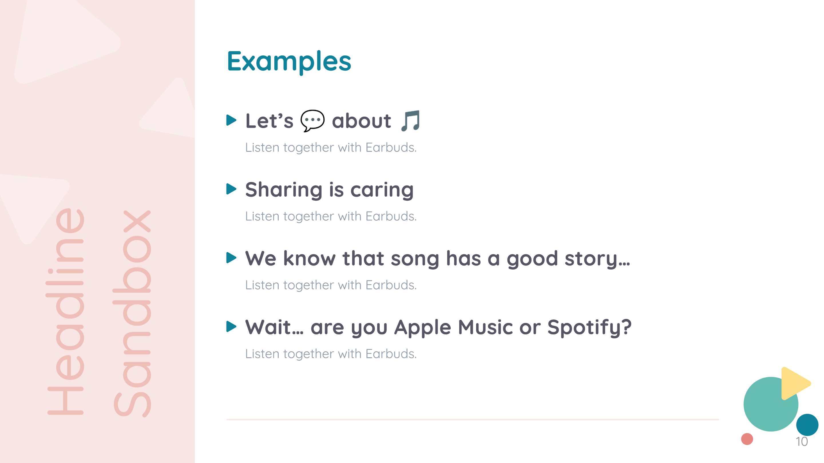
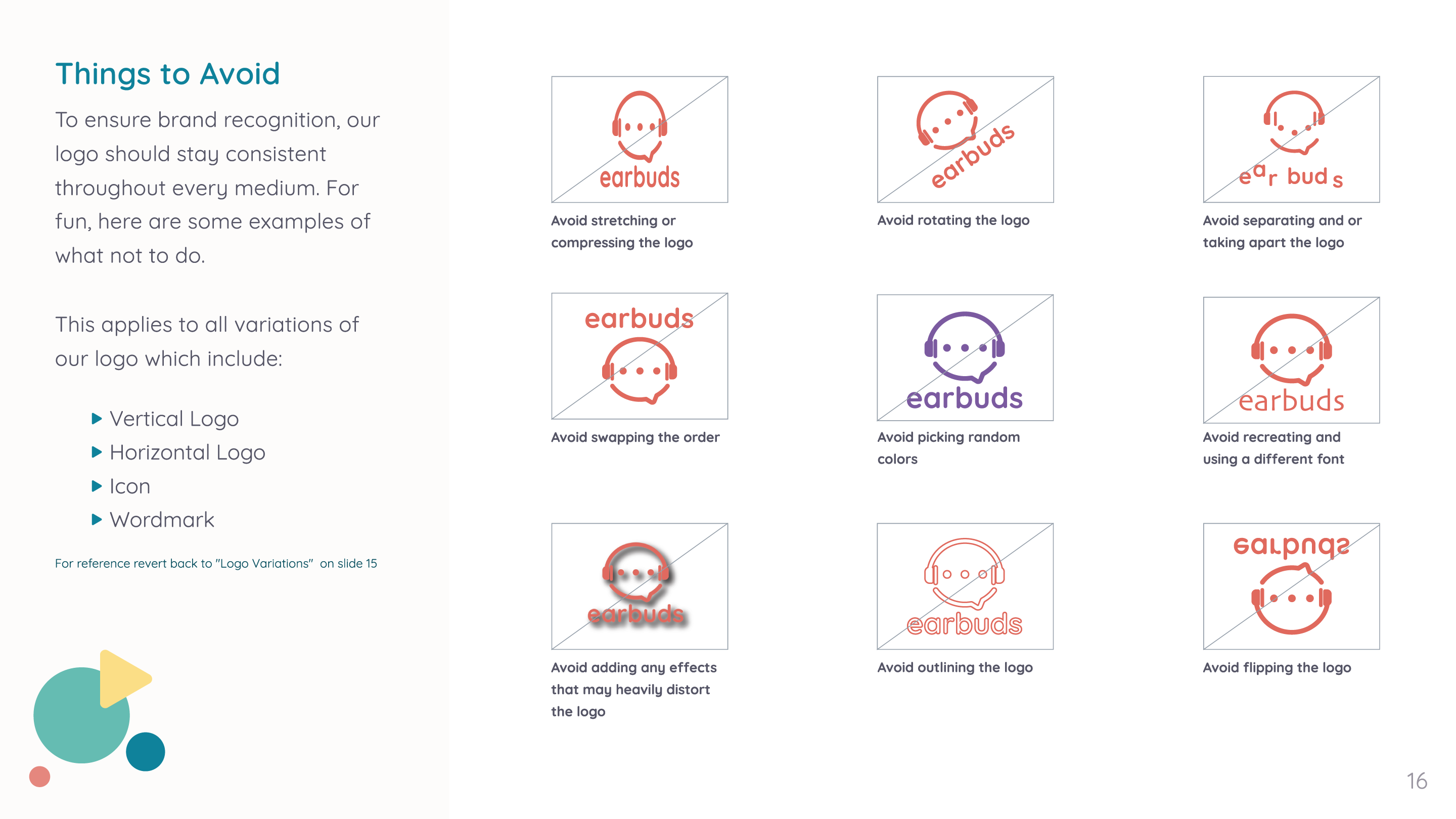
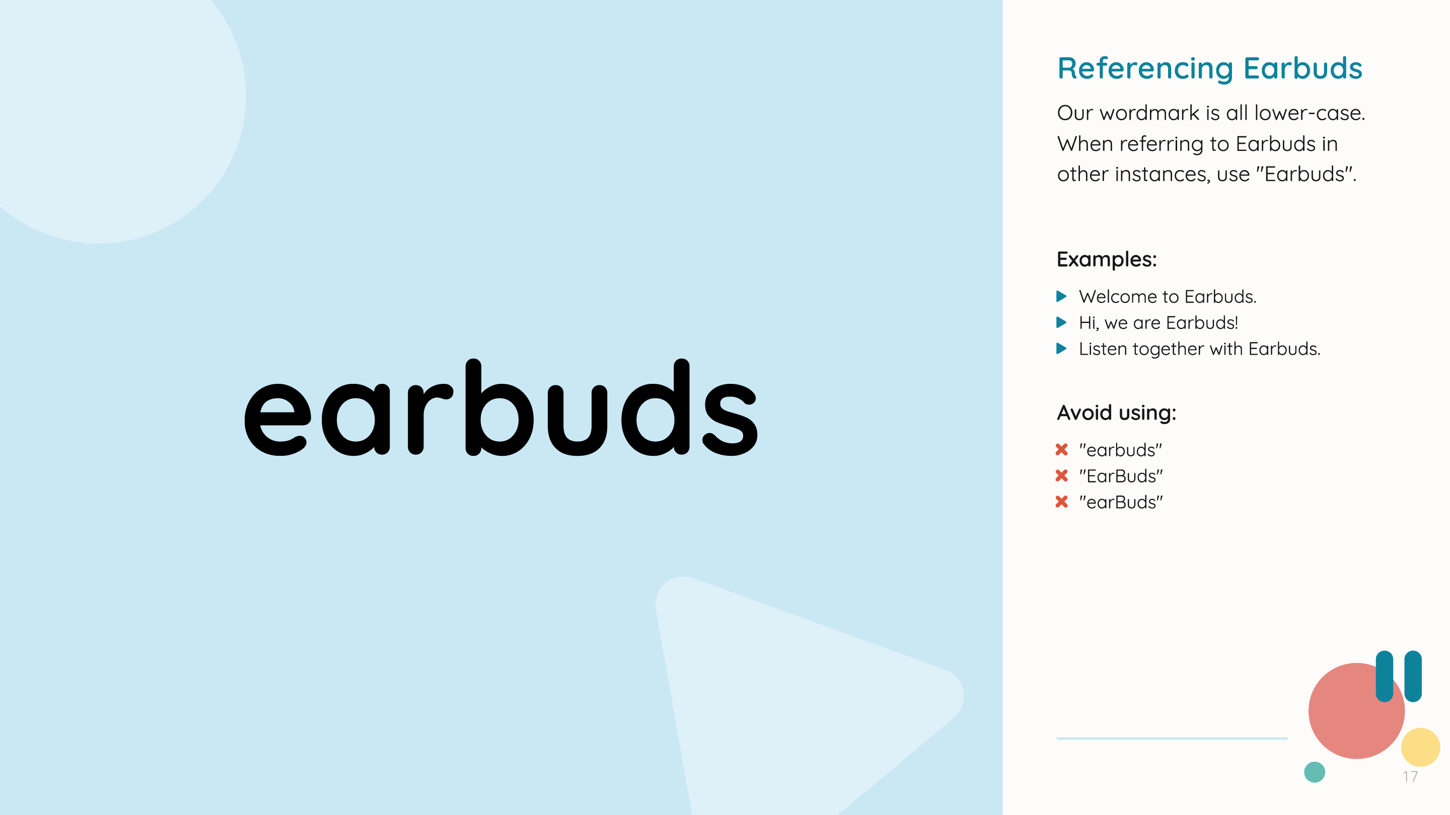
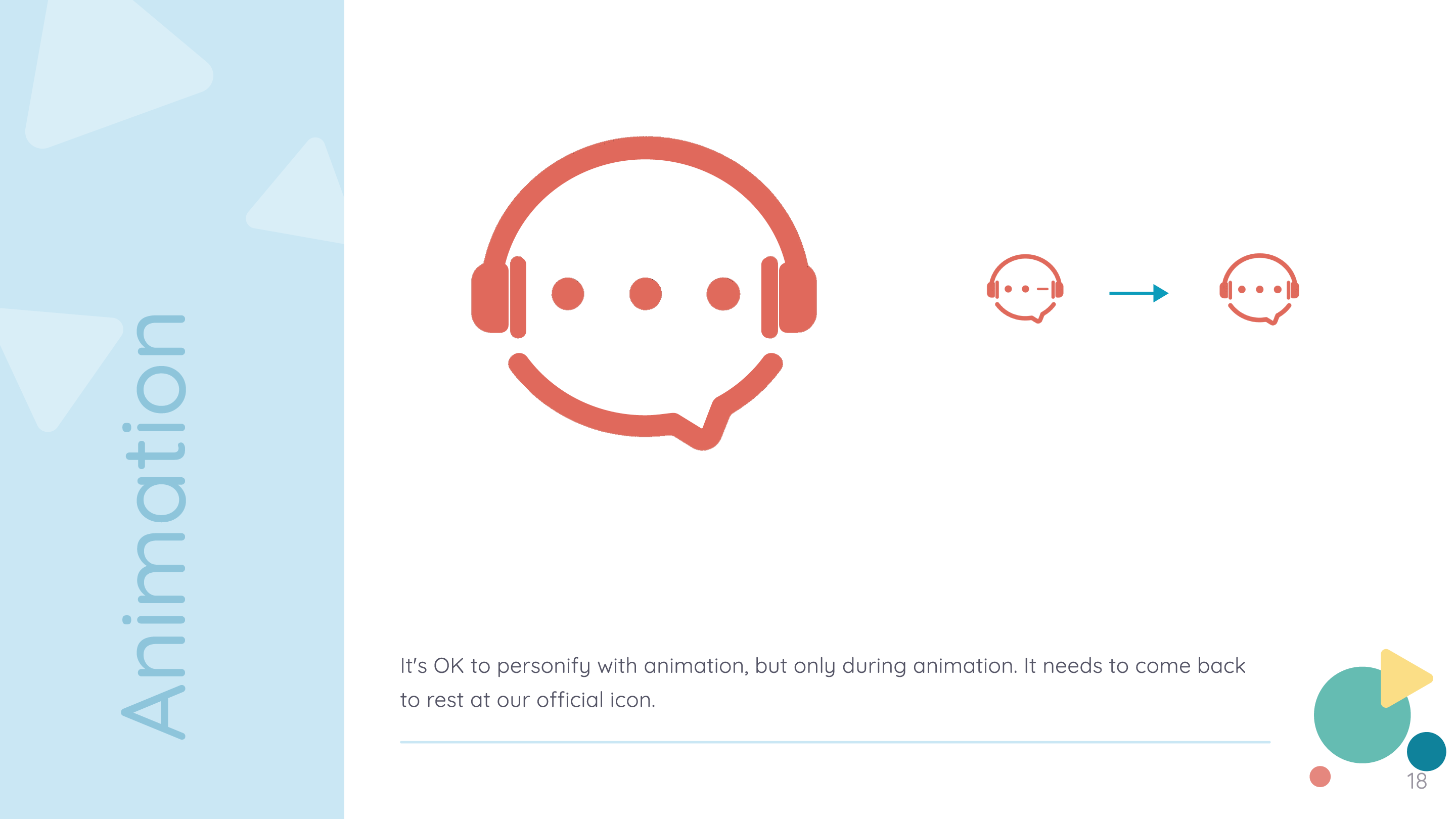
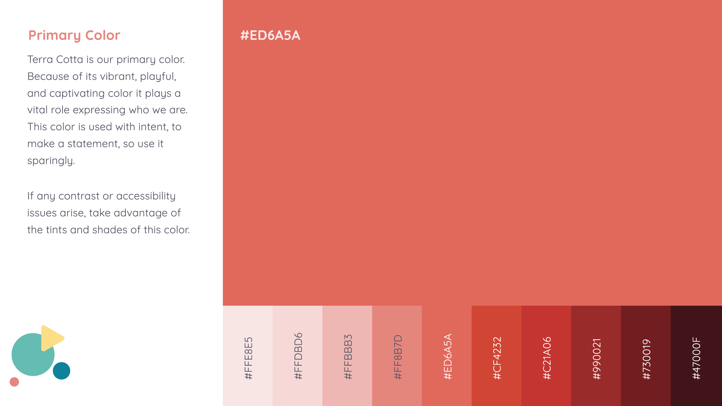
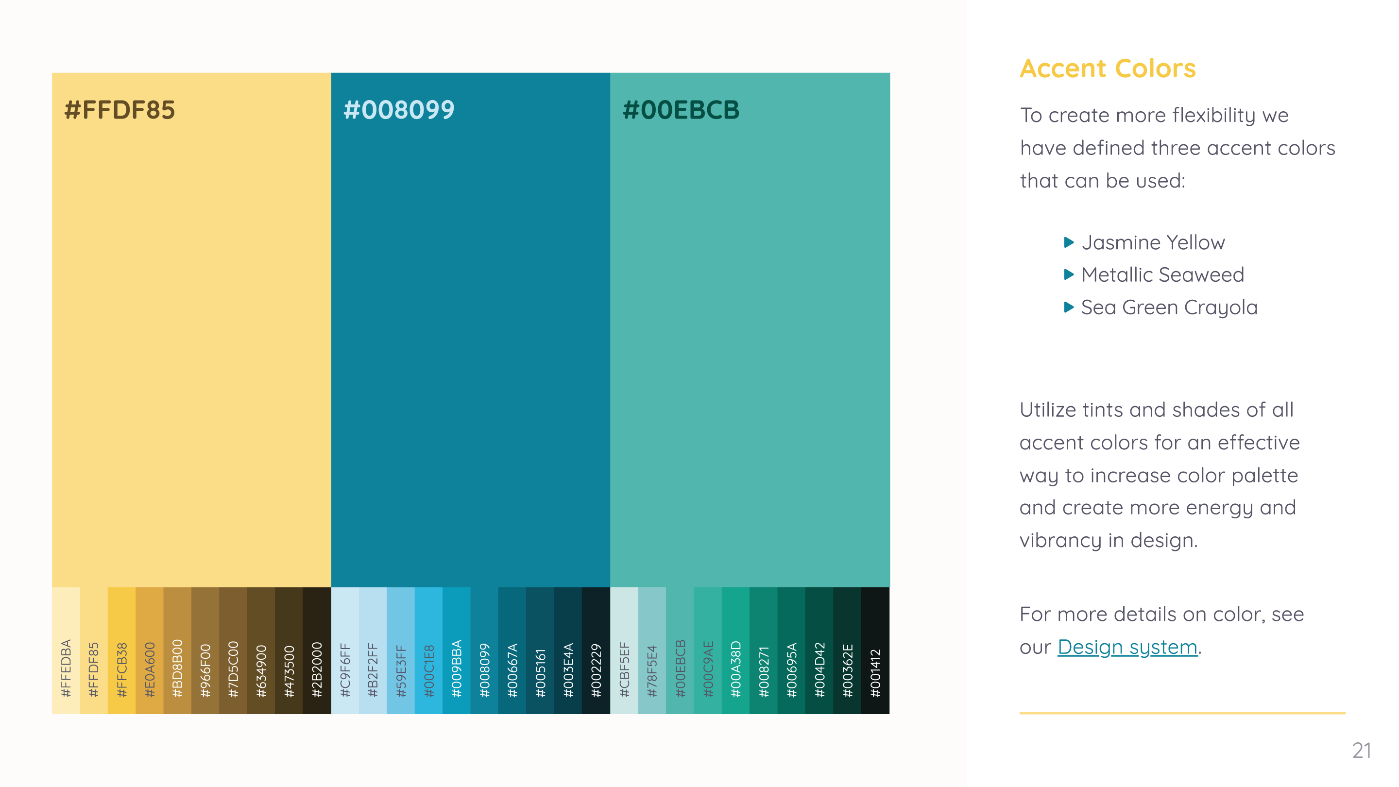
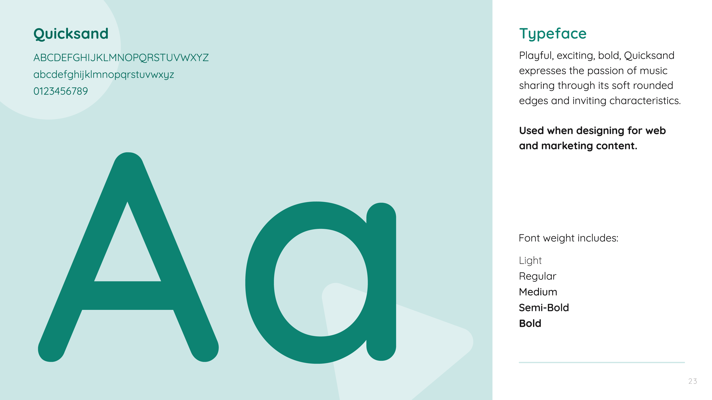
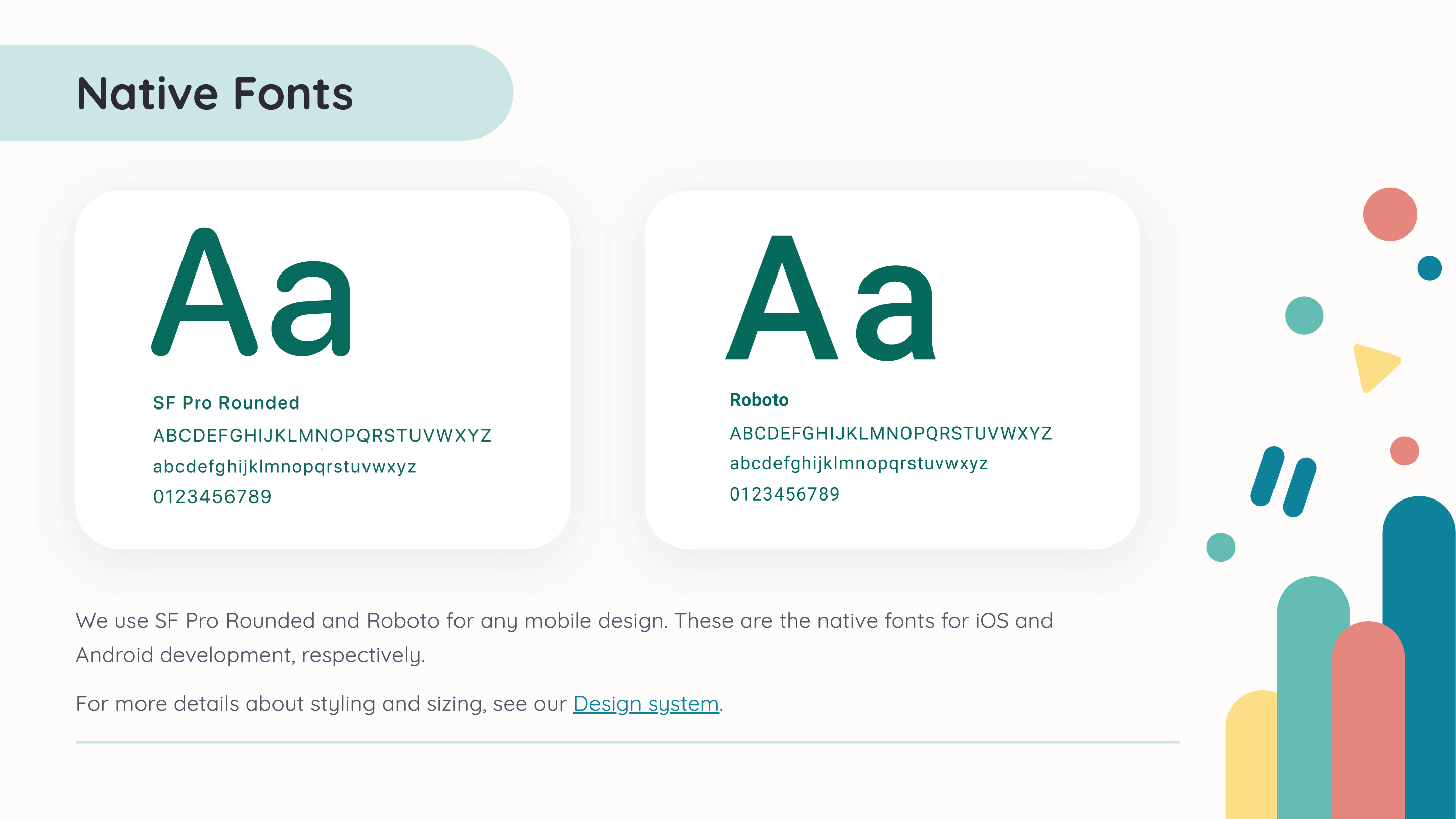
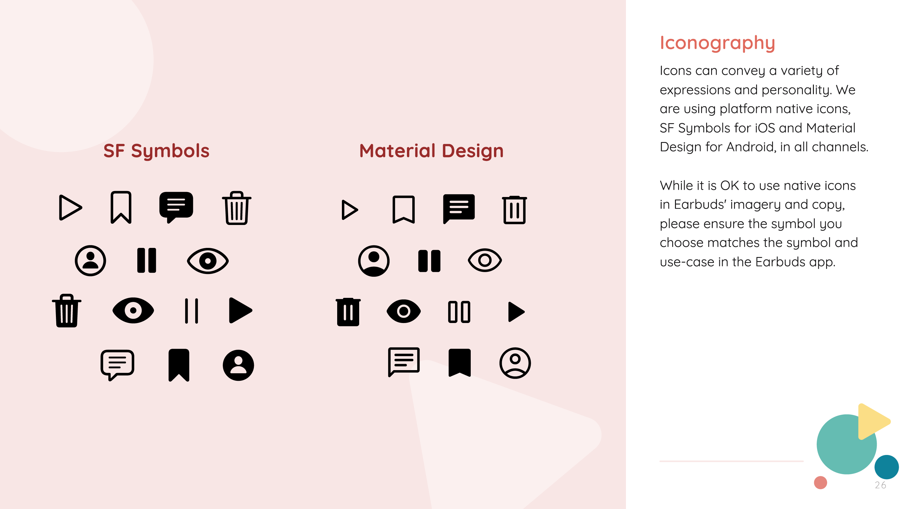
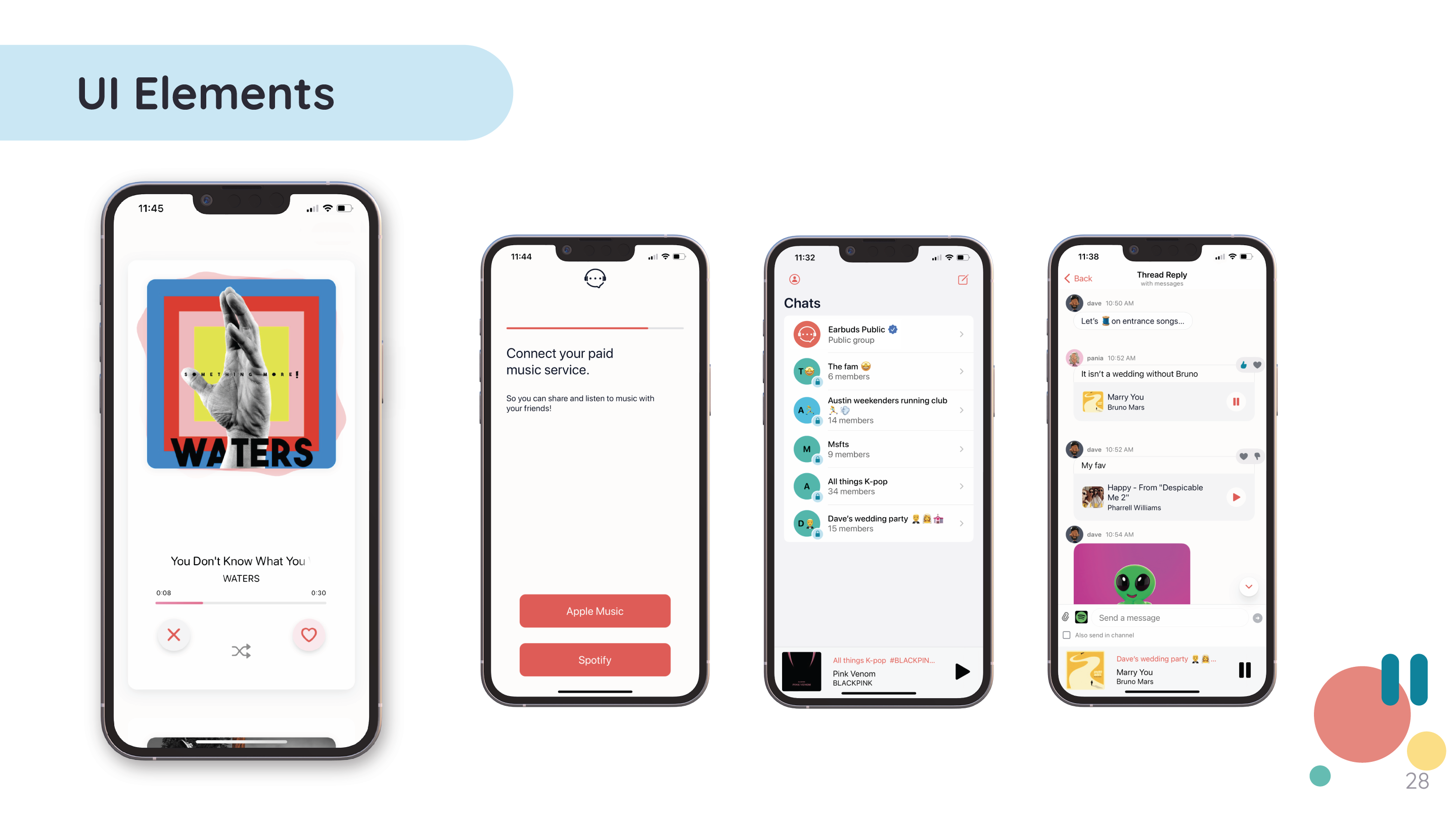
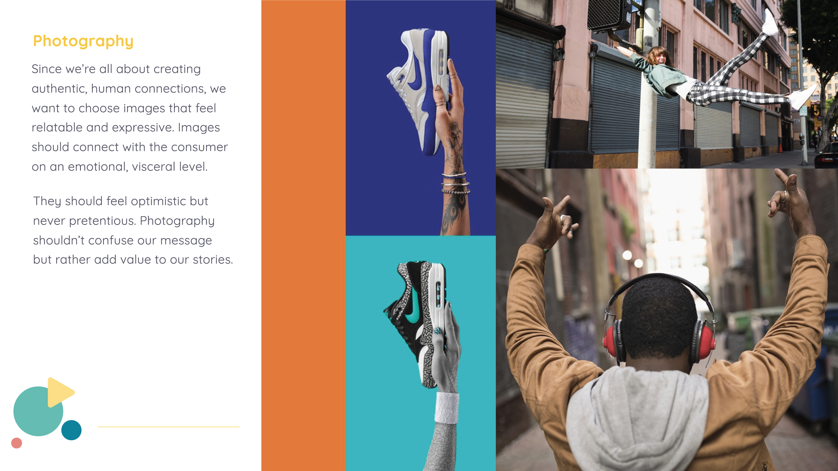
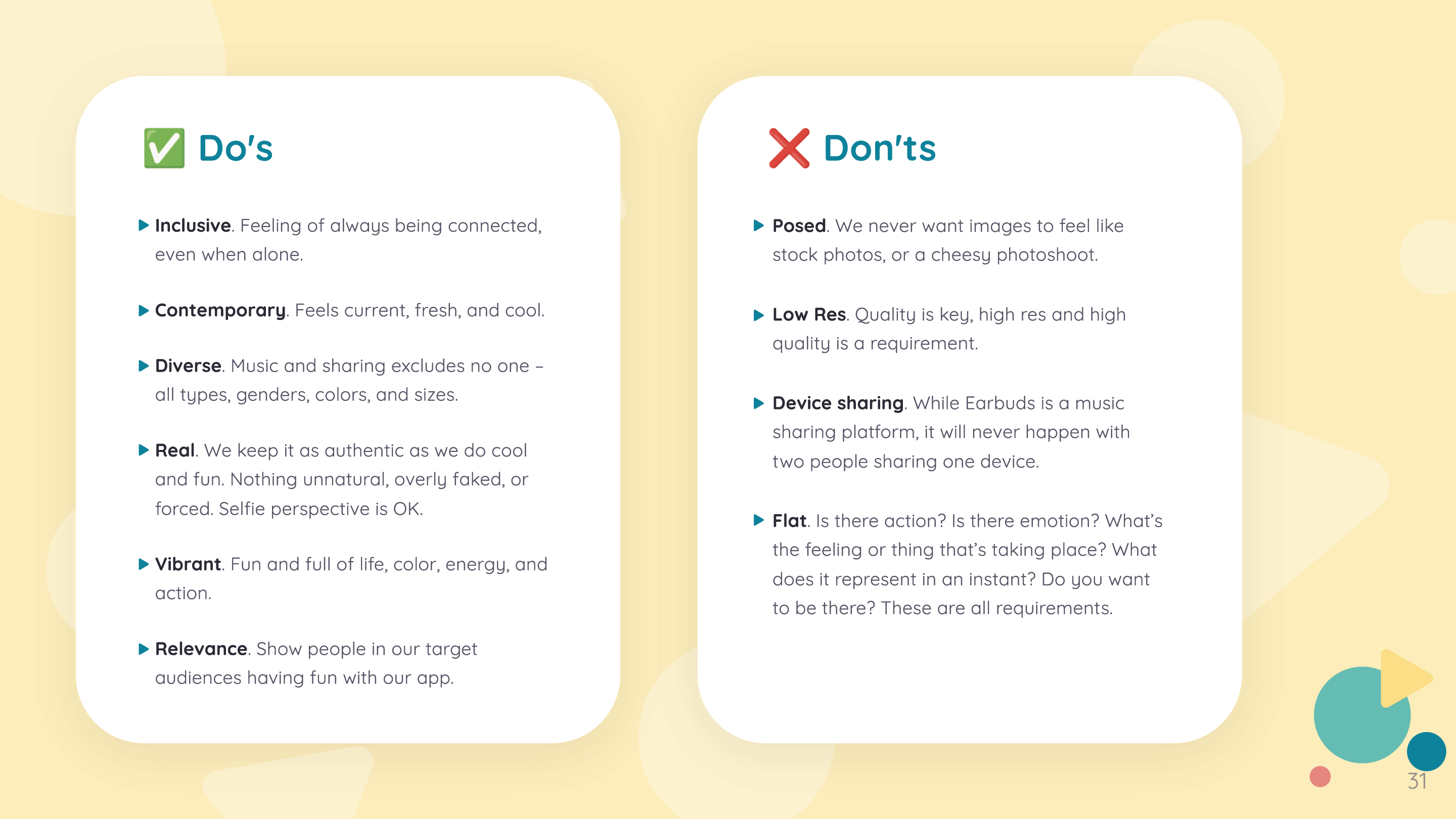
With the new logo, a revamp of the brand guidelines was necessary to fit the company’s new identity. This was carefully crafted to serve as a comprehensive reference for how a brand should be presented visually and verbally across various mediums and platforms.
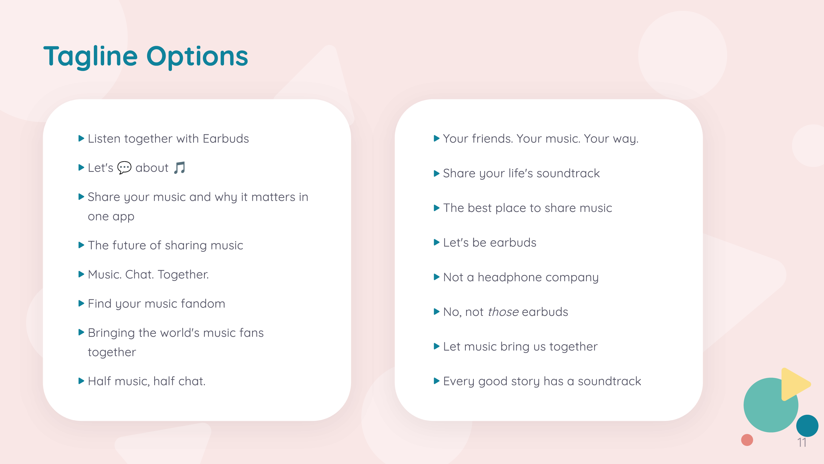

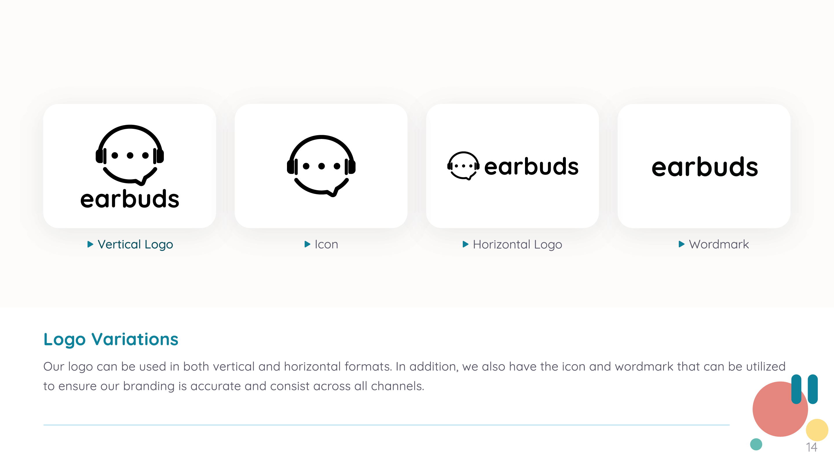
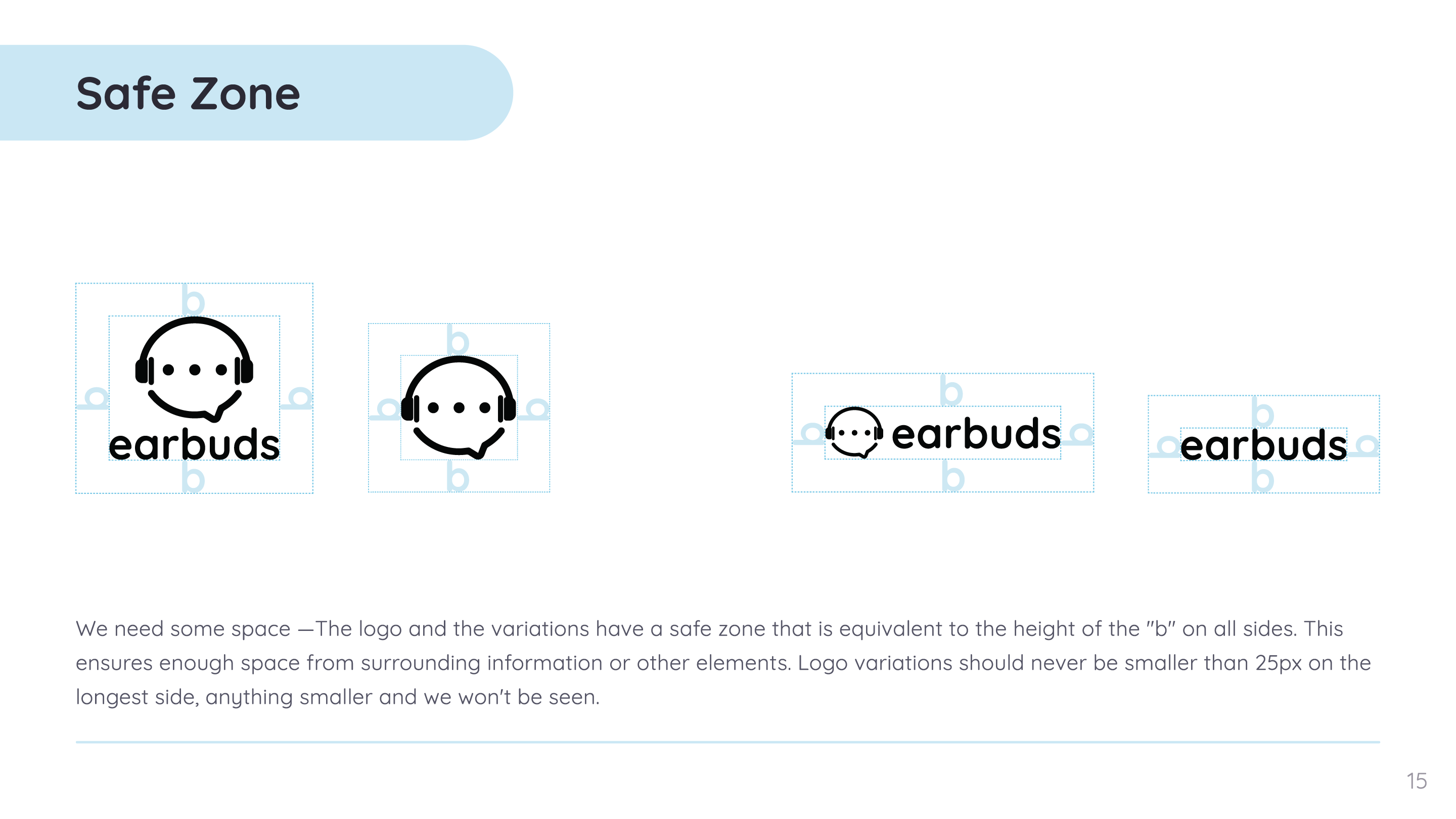


/Fin
Despite minor challenges such as adapting colors to Display P3 and updating outdated logos, the transition from old to new was largely smooth. The refreshed brand identity allowed us to effectively communicate our new vision and establish a stronger brand presence.
With this company being in a pivotal position and also being a startup there was a time constraint of less than 2 weeks to finish this project. There was a lot of pressure here because the logo and brand identity is what gets presented across all platforms and I didn’t want to get it wrong. Although it’s not perfect, the design closely aligns with our objectives. Looking back I would have liked to refine the logo to help differentiate it from other apps. As for the brand guidelines that were thoughtfully crafted, as the app progressed I would have liked to update the imagery and the UI elements to match what was current in the app.

